Gaming Behavior Predict

小组作业

背景

游戏或许是一种策略游戏,但数据集显示,玩家行为背后的指标远非如此简单。在本篇笔记中,我们将深入分析一个捕捉在线游戏行为细微差别的数据集,挖掘隐藏的模式,并构建一个预测模型,以检验我们能否预测玩家的参与度。

参考此部分代码

商业问题

  • 如何根据之前玩家的行为预测玩家在游戏中的参与度。通过预测玩家的活跃程度,游戏开发商可以提前识别出潜在的流失玩家,从而采取针对性的措施,如推送奖励、个性化推荐等,提高玩家的留存率和忠诚度。

  • 玩家重要特征选取:并不是所有特征对玩家的参与度都有很重要的作用,玩家的参与度往往是由几个重要的特征决定的,找到重要的特征有利于商家针对性的优化产品。

数据

使用公开数据集 Predict Online Gaming Behavior Dataset该数据集涵盖了与在线游戏环境中玩家行为相关的全面指标和人口统计数据。它包括玩家人口统计信息、游戏特定细节、参与度指标以及反映玩家留存率的目标变量等变量。

实现的具体流程

  1. 首先对数据进行预处理,将类别信息转化为int类型,使用labelEncoder,并且查看是否有缺失值存在。

    1
    2
    3
    4
    5
    6
    7
    8
    9
    10
    11
    12
    13
    14
    15
    16
    17
    18
    19
    20
    21
    22
    23
    24
    25
    26
    27
    28
    29
    30
    31
    32
    33
    34
    35
    36
    37
    38
    39
    40
    41
    42
    43
    44
    45
    46
    47
    48
    49
    50
    51
    52
    53
    # Import necessary libraries and suppress warnings
    import warnings
    warnings.filterwarnings('ignore')

    import numpy as np
    import pandas as pd
    import time
    import matplotlib
    matplotlib.use('Agg') # use Agg backend for matplotlib
    import matplotlib.pyplot as plt
    %matplotlib inline

    import seaborn as sns
    import math
    from sklearn.model_selection import train_test_split
    from sklearn.preprocessing import LabelEncoder, StandardScaler
    from sklearn.ensemble import RandomForestClassifier
    from sklearn.metrics import accuracy_score, confusion_matrix, roc_curve, auc

    # For reproducibility
    np.random.seed(42)
    file_path = 'online_gaming_behavior_dataset.csv'
    df = pd.read_csv(file_path, encoding='ascii', delimiter=',')
    # A little dry humor for the data geeks: If our visualizations don't win you over, at least our code comments might.
    # Data Cleaning and Preprocessing

    # Check for missing values and data types
    print('Data types:')
    print(df.dtypes)

    print('\nMissing values per column:')
    print(df.isnull().sum())

    # In our dataset, we assume there are no date columns. However, if any date strings are found, you might use pd.to_datetime

    # Encode categorical features
    categorical_cols = ['Gender', 'Location', 'GameGenre', 'GameDifficulty', 'EngagementLevel']

    # Label encoding for categorical columns for simplicity in both EDA and predictive modeling
    le = LabelEncoder()
    for col in categorical_cols:
    # It's a common pitfall to not check for missing values before encoding
    df[col] = df[col].astype(str) # ensure textual data
    df[col] = le.fit_transform(df[col])

    # Scaling numeric features for better performance in the prediction model
    numeric_cols = ['Age', 'PlayTimeHours', 'InGamePurchases', 'SessionsPerWeek', 'AvgSessionDurationMinutes', 'PlayerLevel', 'AchievementsUnlocked']
    scaler = StandardScaler()
    df[numeric_cols] = scaler.fit_transform(df[numeric_cols])

    # Final dataset preview
    print('\nCleaned dataset preview:')
    df.head()

    image-20251108104454809

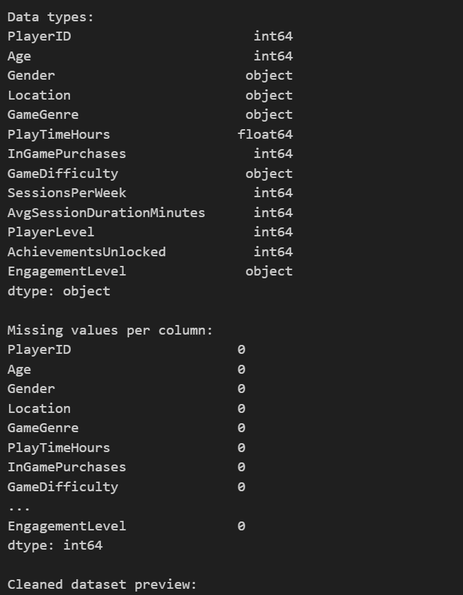
​ 2.对数据进行可视化,简略查看数据的分布和之间的联系

1
2
3
4
5
6
7
8
9
10
11
12
13
14
15
16
17
18
19
20
21
22
23
24
25
26
27
28
29
30
31
32
33
34
35
36
37
38
39
40
# Exploratory Data Analysis

# Let's create several visualization plots to gain insights into the data. If you ever run into issues with plotting, check that you are using the correct backend and inline settings.

# 1. Histograms for numeric columns
plt.figure(figsize=(15, 10))
for i, col in enumerate(['Age', 'PlayTimeHours', 'InGamePurchases', 'SessionsPerWeek', 'AvgSessionDurationMinutes', 'PlayerLevel', 'AchievementsUnlocked'], 1):
plt.subplot(3, 3, i)
sns.histplot(df[col], kde=True, color='blue')
plt.title(f'Distribution of {col}')
plt.tight_layout()
plt.show()

# 2. Box plots for numeric columns
plt.figure(figsize=(15, 10))
for i, col in enumerate(['Age', 'PlayTimeHours', 'InGamePurchases', 'SessionsPerWeek', 'AvgSessionDurationMinutes', 'PlayerLevel', 'AchievementsUnlocked'], 1):
plt.subplot(3, 3, i)
sns.boxplot(y=df[col], color='green')
plt.title(f'Box plot of {col}')
plt.tight_layout()
plt.show()

# 3. Heatmap for correlations if there are at least four numeric features
numeric_df = df.select_dtypes(include=[np.number])
if numeric_df.shape[1] >= 4:
plt.figure(figsize=(10, 8))
corr = numeric_df.corr()
sns.heatmap(corr, annot=True, cmap='coolwarm', fmt='.2f')
plt.title('Correlation Heatmap of Numeric Features')
plt.show()

# 4. Pair plot to explore feature relationships a bit further
sns.pairplot(df[numeric_df.columns])
plt.show()

# 5. Count Plot for EngagementLevel (after encoding, these become numbers; in a real scenario, one might map back to labels)
plt.figure(figsize=(8, 6))
sns.countplot(x='EngagementLevel', data=df, palette='Set2')
plt.title('Count Plot of Engagement Level')
plt.show()

部分结果如下:

image-20251108104823772

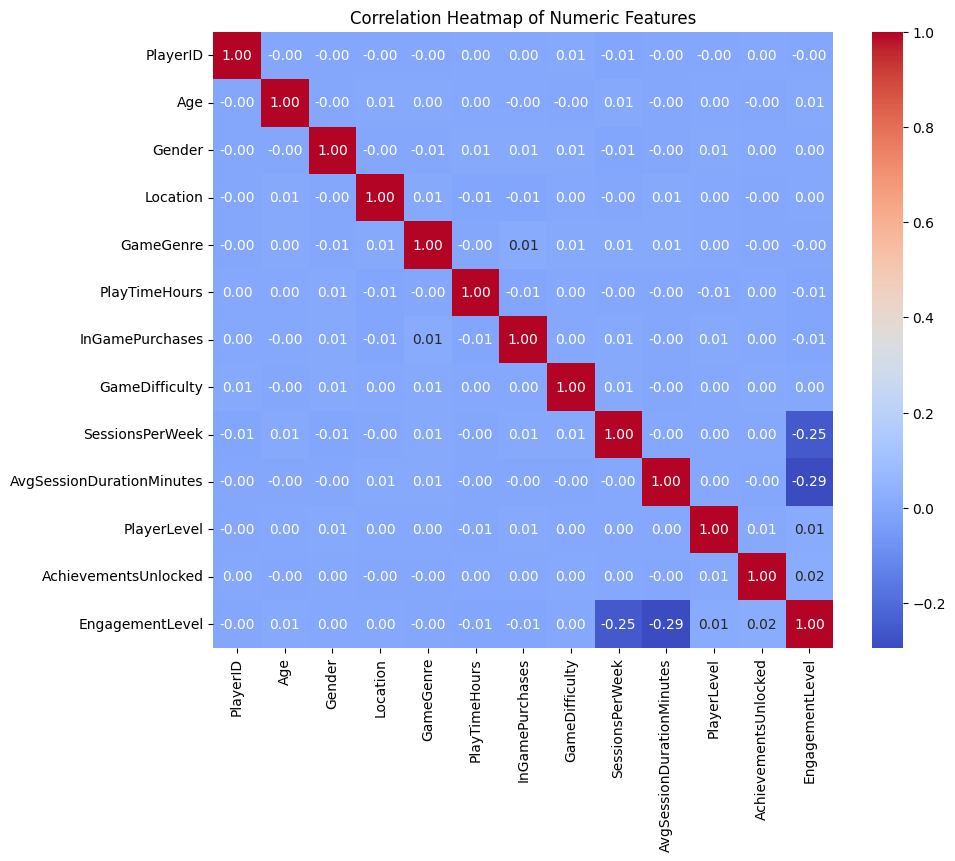
从上面的第三幅图热点图中可以看出:AvgSessionDurationMinutes和SessionsPerWeek与要预测的结果EngagementLevel都有很强的关联。

​ 3.训练基准模型,使用全部的特征进行训练,此时选用随机森林作为模型。并且计算出混淆矩阵和ROC曲线以及特征重要性

1
2
3
4
5
6
7
8
9
10
11
12
13
14
15
16
17
18
19
20
21
22
23
24
25
26
27
28
29
30
31
32
33
34
35
36
37
38
39
40
41
42
43
44
45
46
47
48
49
50
51
52
53
54
55
56
57
58
59
60
61
62
63
64
65
66
67
# Predictive Modeling

# In this section, we create a predictor to estimate the EngagementLevel of a player using various features.

# Define features (X) and target (y)
# We drop PlayerID since it is just an identifier and use the rest as predictors
features = df.drop(columns=['PlayerID', 'EngagementLevel'])
target = df['EngagementLevel']

# Split the data into train and test sets
X_train, X_test, y_train, y_test = train_test_split(features, target, test_size=0.2, random_state=42)
# 记录开始时间
start_time = time.time()
print("Train finished, total time:", time.time() - start_time)
# A random forest classifier is chosen for its versatility and robustness
model = RandomForestClassifier(n_estimators=100, random_state=42)
model.fit(X_train, y_train)
end_time = time.time()
# Predictions and evaluation
y_pred = model.predict(X_test)
accuracy = accuracy_score(y_test, y_pred)
print(f"Prediction Accuracy: {accuracy:.2f}")

# Confusion matrix to further visualize performance
cm = confusion_matrix(y_test, y_pred)
plt.figure(figsize=(6, 5))
sns.heatmap(cm, annot=True, fmt='d', cmap='Blues')
plt.title('Confusion Matrix')
plt.xlabel('Predicted')
plt.ylabel('Actual')
plt.show()

# ROC Curve - Since this is a multi-class problem, we will demonstrate a one-vs-rest approach for one class
from sklearn.preprocessing import label_binarize
n_classes = len(np.unique(target))
y_test_bin = label_binarize(y_test, classes=range(n_classes))
y_score = model.predict_proba(X_test)

fpr = dict()
tpr = dict()
roc_auc = dict()
for i in range(n_classes):
fpr[i], tpr[i], _ = roc_curve(y_test_bin[:, i], y_score[:, i])
roc_auc[i] = auc(fpr[i], tpr[i])

# Plot ROC curve for the first class as an example;
plt.figure(figsize=(8, 6))
plt.plot(fpr[0], tpr[0], color='darkorange', lw=2, label=f'ROC curve (area = {roc_auc[0]:0.2f})')
plt.plot([0, 1], [0, 1], color='navy', lw=2, linestyle='--')
plt.xlim([0.0, 1.0])
plt.ylim([0.0, 1.05])
plt.xlabel('False Positive Rate')
plt.ylabel('True Positive Rate')
plt.title('Receiver Operating Characteristic for Class 0')
plt.legend(loc="lower right")
plt.show()

# Permutation Importance (simple version using feature importances from our model)
importances = model.feature_importances_
indices = np.argsort(importances)

plt.figure(figsize=(10, 6))
plt.barh(range(len(indices)), importances[indices], color='b', align='center')
plt.yticks(range(len(indices)), [features.columns[i] for i in indices])
plt.xlabel('Relative Importance')
plt.title('Feature Importances')
plt.show()

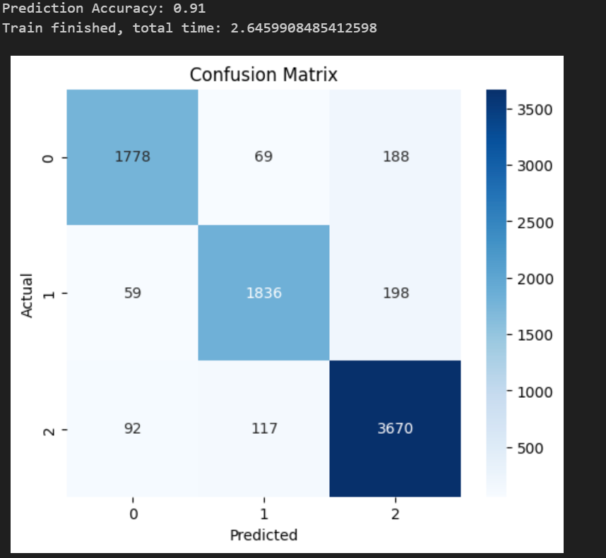
训练的准确度为0.91,验证了模型的可用性,并且训练的时间为2.64,作为基准将和后面的进行对比。

image-20251108105624575

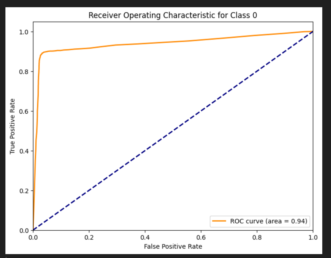
AUC值为0.94,再次验证该模型的可用性,具体ROC和AUC的计算参考另一篇文档 ROC曲线和AOC值

image-20251108105822322

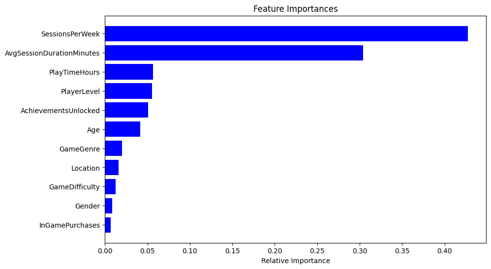
最后是特征的重要度,与上面数据分析部分一致,AvgSessionDurationMinutes和SessionsPerWeek与要预测的结果EngagementLevel都有很强的关联。

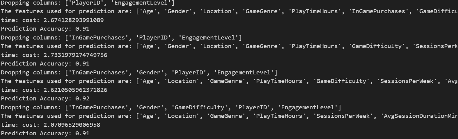
​ 4.选取不同的特征组合进行训练模型:选取的逻辑根据上图特征重要程度的图片,按照重要程度从低到高依次累积删除,具体就是先删除0个特征,此时就是上面的基准模型,然后删除一个,就是最后一个特征:InGamePurchases。然后累计删除两个:Gender+InGamePurchases。依次类推。

1
2
3
4
5
6
7
8
9
10
11
12
13
14
15
16
17
18
19
20
21
22
23
24
25
26
27
28
29
30
31
32
features_sorted=[features.columns[i] for i in indices]
# Predictive Modeling
accuracy_list=[]
time_list=[]
reserve_num=4
# In this section, we create a predictor to estimate the EngagementLevel of a player using various features.
for i in range(len(features_sorted)-reserve_num+1):
dropcol=features_sorted[:i]
dropcol.extend(['PlayerID', 'EngagementLevel'])
print(f"Dropping columns: {dropcol}")
features_selected=df.drop(columns=dropcol)
print(f"The features used for prediction are: {features_selected.columns.tolist()}")
# Define features (X) and target (y)
# We drop PlayerID since it is just an identifier and use the rest as predictors
target = df['EngagementLevel']

# Split the data into train and test sets
X_train, X_test, y_train, y_test = train_test_split(features_selected, target, test_size=0.2, random_state=42)
# 记录开始时间
start_time = time.time()
# A random forest classifier is chosen for its versatility and robustness
model = RandomForestClassifier(n_estimators=100, random_state=42)
model.fit(X_train, y_train)
end_time = time.time()
print("time: cost:", end_time - start_time)
# Predictions and evaluation
y_pred = model.predict(X_test)
accuracy = accuracy_score(y_test, y_pred)
accuracy_list.append(accuracy)
time_list.append(end_time - start_time)
print(f"Prediction Accuracy: {accuracy:.2f}")

部分输出如下:

image-20251108110404880

5.可视化输出

1
2
3
4
5
6
7
8
9
10
11
12
13
14
15
16
17
18
19
20
X=list(range(0,len(features_sorted)-reserve_num+1))
print(accuracy_list)
print(time_list)
log_score = [math.log(x) for x in accuracy_list]
fig, ax1 = plt.subplots()
ax1.plot(X, log_score, 'g-')
ax1.scatter(X, log_score, color='r')
ax1.set_xlabel('Dropped Features Count')
ax1.set_ylabel('log accuracy_score', color='g')

ax1.set_ylim(-0.13,-0.08)
# 创建第二个 y 轴
ax2 = ax1.twinx()

# 绘制第二个 y 轴的柱状图
ax2.bar(X, time_list, width=0.2, color='b', align='center') # 设置柱子的宽度、颜色和对齐方式
ax2.set_ylabel('Time cost', color='b')
ax2.set_ylim(1,4)
# 显示图形
plt.show()

image-20251108110452771

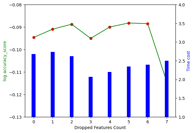
最终结果如上图所示,其中横坐标是删去的特征数量,左边的竖坐标是训练的准确度,为了更好的区分几个相近的准确度,使用log(准确度)log(准确度) ,对应折线图。右侧的竖坐标是训练消耗的时间,对应柱状图。结果展示了两个结论:

  • 并不是将所有特征都使用到模型效果才好,随着特征数量的减少,训练结果分数反而可能会变好,并且过多的输入特征会导致训练时间的增加,增加企业时间成本。
  • 当删除7个特征的时候,准确度大幅减少,说明删除的第7个以及还没有删除的特征都有很强的作用,企业可以针对这几个特征进行优化